TailwindCSS+Next.js でDarkモードを実装する
2025-05-05
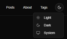
Shadcn UIとnext-themesライブラリを使用すると、ダークモード機能を簡潔に実装できる。
こういうやつ。
以下を参考にしている。 Shadcn UI ダークモード
1. next-themesのインストール
まず、next-themesパッケージをインストールする:
npm install next-themes
2. ThemeProviderコンポーネントの作成
src/componentsディレクトリにtheme-provider.tsxファイルを作成する:
// src/components/theme-provider.tsx
"use client"

import * as React from "react"
import { ThemeProvider as NextThemesProvider } from "next-themes"

export function ThemeProvider({
  children,
  ...props
}: React.ComponentProps<typeof NextThemesProvider>) {
  return <NextThemesProvider {...props}>{children}</NextThemesProvider>
}
3. アプリケーションへの統合
_app.tsxで、ThemeProviderを使用する:
// pages/_app.tsx
import '../styles/globals.css';
import { Analytics } from '@vercel/analytics/next';
import type { AppProps } from 'next/app';
import { ThemeProvider } from '@/components/theme-provider';

function MyApp({ Component, pageProps }: AppProps) {
  return (
    <ThemeProvider
      attribute="class"
      defaultTheme="system"
      enableSystem
      disableTransitionOnChange
    >
      <Component {...pageProps} />
      <Analytics />
    </ThemeProvider>
  );
}

export default MyApp;
4. テーマ切り替えボタンの作成
theme-toggle.tsxファイルを作成して、next-themesを使用するようにする:
// src/components/ui/theme-toggle.tsx
"use client"

import { useTheme } from "next-themes";
import { Button } from "@/components/ui/button";
import { Moon, Sun, Monitor } from "lucide-react";
import {
  DropdownMenu,
  DropdownMenuContent,
  DropdownMenuItem,
  DropdownMenuTrigger
} from "@/components/ui/dropdown-menu";

export function ThemeToggle() {
  const { setTheme } = useTheme();

  return (
    <DropdownMenu>
      <DropdownMenuTrigger asChild>
        <Button variant="outline" size="icon" className="rounded-full">
          <Sun className="h-[1.2rem] w-[1.2rem] rotate-0 scale-100 transition-all dark:rotate-90 dark:scale-0" />
          <Moon className="absolute h-[1.2rem] w-[1.2rem] rotate-90 scale-0 transition-all dark:rotate-0 dark:scale-100" />
          <span className="sr-only">テーマを切り替え</span>
        </Button>
      </DropdownMenuTrigger>
      <DropdownMenuContent align="end">
        <DropdownMenuItem onClick={() => setTheme("light")}>
          <Sun className="mr-2 h-4 w-4" />
          <span>Light</span>
        </DropdownMenuItem>
        <DropdownMenuItem onClick={() => setTheme("dark")}>
          <Moon className="mr-2 h-4 w-4" />
          <span>Dark</span>
        </DropdownMenuItem>
        <DropdownMenuItem onClick={() => setTheme("system")}>
          <Monitor className="mr-2 h-4 w-4" />
          <span>System</span>
        </DropdownMenuItem>
      </DropdownMenuContent>
    </DropdownMenu>
  );
}
5. theme-toggle.tsxを配置
あとは、theme-toggle.tsxを配置するだけ。
import { ThemeToggle } from "@/components/ui/theme-toggle";

<ThemeToggle />
TailwindCSSでのダークモードスタイリング
dark:プレフィックスを使ってダークモード用のスタイルを指定する。例えば:
<div className="bg-white text-black dark:bg-gray-900 dark:text-white">
  ダークモードに対応したコンテンツ
</div>
これにより、ライトモードでは白背景に黒テキスト、ダークモードでは暗いグレー背景に白テキストとなる。
:root {
  --background: oklch(1 0 0);
  --foreground: oklch(0.145 0 0);
  /* 他のライトモード変数 */
}

.dark {
  --background: oklch(0.145 0 0);
  --foreground: oklch(0.985 0 0);
  /* 他のダークモード変数 */
}
そして、Tailwindの設定ファイルでこれらの変数を参照する:
// tailwind.config.js
module.exports = {
  // ...
  theme: {
    extend: {
      colors: {
        background: 'var(--background)',
        foreground: 'var(--foreground)',
        // 他のカラー変数
      },
    },
  },
  // ...
}
これにより、bg-backgroundやtext-foregroundのようなクラスでテーマに応じた色を適用できる。
おわり